
Last Updated on February 15, 2024
Many people around the world dream of creating their websites. Today, many tools, including artificial intelligence, can handle this almost instantly. On the other hand, the magic of having built something with your own hands disappears. Imagine it on the construction of a family house. It is something else when a specialized company builds such a house for you, and you do not have to participate in the construction. However, if you build such a house with your own hands, it has an entirely different and very personal value for you. That is why, even today, some individuals want to try to program their simple website at least. And not through simplifying tools but through your programming.
Creating a simple website using HTML (HyperText Markup Language) and CSS (Cascading Style Sheets) is an essential skill today for anyone who wants to delve deeper into website design. I remember the first time I encountered HTML and CSS. In the computer class, we learned how to structure an HTML document and create the basic skeleton of a simple HTML website. We wrote simple commands in Notepad in Windows. It was magical when such code became a living organism in the form of a functional web page that could be further enriched through styling (CSS). With this, we defined the website’s visual appearance, including layout, colors, fonts, and responsive design features that will make the website look good on all devices.
I want to share this magic of creating a website with your own hands right now with you and give you the great feeling of creating your website. In the following text, we will gradually go through this entire process. If you want to progress from theory to practice, move directly to the chapter: A Practical Example of Creating a Simple HTML and CSS Website.
Make Simple Website Using HTML and CSS: Key Takeaways
- HTML and CSS are foundational for building and styling websites.
- Start with HTML structure, then use CSS for design and layout.
- Employ web development best practices for a functional, maintainable site.
- Make Simple Website Using HTML and CSS: Key Takeaways
- Setting Up the Environment
- Structuring the HTML Document
- Designing the Layout
- Styling the Elements
- Enhancing User Experience
- Finalizing the Website
- Best Practices in Web Development
- Expanding Your Website
- A practical example of creating a simple HTML and CSS website
- Styling the HTML layout with CSS
- Frequently Asked Questions
- What are the basic steps to create a web page using HTML and CSS?
- Where can I find an example source code for a simple HTML and CSS website?
- How can I design a multi-page website using HTML and CSS?
- Can you create a login page with HTML and CSS, and is there an example?
- What is the process of building a website from scratch using HTML on a basic text editor like Notepad?
- What are some excellent resources or tutorials for learning to design web pages with HTML and CSS?
Setting Up the Environment
At the beginning of the process, you must choose a suitable environment for creating your website. Many tools can ensure this. You need to select a code editor that will suit your needs and can work with HTML and CSS code.
Choosing a Code Editor
Your code editor is the central hub where you will write, edit, and organize your source code. Visual Studio Code is highly recommended to balance power and simplicity with an intuitive interface and extensive extension marketplace. Other popular editors include Sublime Text, Atom, and Brackets. These platforms support the coding languages you’ll be using and often come with helpful tools like syntax highlighting and auto-completion, which can bolster your coding skills.
However, suppose you do not want to use any of the above-mentioned tools. In that case, you can also use the native notepad in your operating system, whether TextEdit (Mac) or Notepad (Windows).
Understanding the Basics of HTML and CSS
To create your website, you’ll need to write HTML tags that define the structure and content of your pages. Each HTML element—from headers to paragraphs—is a building block in your webpage layout. Meanwhile, CSS properties are used to style these elements, applying CSS rules for color, font, layout, and more. When you style an element with CSS, you assign aesthetic characteristics to the HTML elements in your website’s design. It is essential to get these basics right because they are an important part of your successful start in building your website.
| Element | Function | Purpose |
|---|---|---|
| <b> | Bold | Makes a certain part of the text bold. |
| <strong> | Strong | Highlights an important part of the text. |
| <i> | Italic | It makes a certain part of the text bold. |
| <mark> | Mark | Highlights the background of the text. |
| <small> | Small | It makes a certain part of the text bold. |
| <strike> | Strike | |
| <u> | Underline | Underlines a certain part of the text. |
| <ins> | Insert | It displays text as embedded. |
| <sub> | Subscript | The text will be styled as subscript. |
| <sup> | Superscript | The text will be styled as superscript. |
Structuring the HTML Document
Before embarking on the journey of building a simple website, it’s crucial to understand the skeleton of an HTML document. You’ll learn to properly define the document type, create the head with title tags, and construct the body structure to ensure your website’s foundation is solid and functional.
Defining the Document Type
The <!doctype html> declaration is vital at the beginning of your HTML file. It tells the web browser what version of HTML the page is written in, and for modern web development, you’ll specify HTML5 with <!doctype html>. This ensures your pages are rendered consistently across different browsers.
<!DOCTYPE html>Defining the Document Language
The <html lang=”en”> declaration is also vital at the beginning of your HTML file. It tells the web browser the default language of the text on the page.
<html lang="en-US">Creating the Head and Title Tags
Inside the <html> tag comes the <head> section, which is like the brain of your HTML document that doesn’t display content but contains metadata. Use the <title> tag within the head to give your webpage a title. This title appears on the browser tab and is crucial for search engine optimization.
Example:
<head>
    <title>Your Page Title</title>
</head>
It is essential to mention that if we use CSS styling for the website and want to change its appearance, it is necessary to define where the CSS file with this code is located. This is usually styles.css.
Example:
<head>
    <title>Your Page Title</title>
    <link rel="stylesheet" href="styles.css">
</head>
Building the Body Structure
Moving into the <body>, this is where all visible content goes, including text, images, and videos. Start with a clear layout, dividing your content into semantic sections such as header, footer, and navigation bar. Utilize <header> for the top of your website, often including your site’s logo and the main navigation menu. The main content area is where your webpage’s information will be displayed. Finally, <footer> defines the bottom part of your site, typically containing contact information, copyright notices, and links to privacy policies.
Layout Example:
<body>
    <header>
        <!-- Navigation bar and logo here -->
    </header>

    <main>
        <!-- Main content goes here -->
    </main>

    <footer>
        <!-- Contact and copyright information here -->
    </footer>
</body>
Remember to keep your structure organized and logical, which not only aids in the development process but also benefits SEO and accessibility.
Designing the Layout
Understanding how to manipulate HTML and CSS is crucial for laying out content in a structured and responsive manner when crafting a website. This involves working with containers such as divs and sections, creating a responsive navigation bar, and using CSS Flexbox to organize your content effectively.
Working with Divs and Sections
Divs are the building blocks of web design, used to segment your HTML content into manageable chunks. By using div elements, you can separate your website content into logical sections. Each div can be styled individually with CSS, setting properties such as width, height, padding, and margin to control spacing and positioning.
A typical HTML structure may look like:
<div id="header"></div>
<div id="menu"></div>
<div id="content"></div>
<div id="footer"></div>
Your corresponding CSS would then define the visual characteristics:
#header, #footer { width: 100%; height: 50px; }
#menu { width: 200px; float: left; }
#content { margin-left: 200px; }
Implementing a Responsive Navbar
Your website’s navbar plays a crucial role in navigating the site content. Using media queries in CSS allows the navbar to adapt to different screen sizes. For instance, you might want a horizontal menu on desktop views but a collapsible menu on mobile devices.
/* Desktop style */
nav { display: flex; justify-content: space-between; }

/* Mobile style */
@media screen and (max-width: 768px) {
  nav { display: block; }
  nav a { display: block; }
}
Organizing Content with CSS Flexbox
CSS Flexbox is a powerful tool for creating dynamic layouts that adjust according to screen size. It quickly enhances the arrangement of elements horizontally or vertically and can distribute space around items uniformly. The display: flex; property enables you to design complex layouts with simpler code, replacing older methods that relied heavily on floats and positioning.
Here’s a basic example of how to use Flexbox:
.container {
  display: flex;
  justify-content: space-around;
}

.item {
  flex: 1; /* Grow to fill available space */
}
With Flexbox, your content automatically reflows as your browser window changes size, reducing the need for explicit width and height definitions in many cases.
Styling the Elements
Styling your website with CSS transforms the primary structure into a visually engaging experience. This section focuses on text and font customization, color and background adjustments, and using images and media to enhance your website’s appearance.
Applying CSS for Text and Fonts
To set the text style across your website, define rules in your CSS file. You can choose the typeface for your web content using the font-family property. The font-size, font-weight, and text-align properties allow you to adjust the size, weight, and alignment of your text. For example, to make your main headings stand out, you might use:
h1 {
    font-family: 'Arial', sans-serif;
    font-size: 24px;
    font-weight: bold;
    text-align: center;
}
Adjusting Colors and Backgrounds
CSS allows you to apply various color and background-color values to your website’s elements, providing a cohesive color scheme. Whether you prefer hex color codes, RGB, or named colors, you can specify text color with the color property and backgrounds via background-color. For instance, setting a soothing blue background on a content box could look like this:
.content-box {
    background-color: #e0f7fa;
    color: #0277bd;
}
Enhancing with Images and Media
Visual appeal can be significantly improved by incorporating images and other media types. To include images, use the <img> tag in your HTML and style it with CSS to dictate dimensions and borders. In your CSS, for embedding responsive media that scales with the web browser, use:
img {
    max-width: 100%;
    height: auto;
    border: 1px solid #ddd;
}
This ensures your images resize appropriately without distorting their aspect ratio, enhancing the user’s visual experience across different devices.
Enhancing User Experience
Creating a simple website with HTML and CSS goes beyond static content. To truly enhance user experience, you must focus on interactivity, responsiveness, and visual engagement. Here’s how to make your website functional, visually appealing, and user-friendly.
Creating Interactive Elements
Making your website interactive involves using HTML and CSS alongside JavaScript to create elements that respond to user actions. For instance, integrating a dropdown menu allows users to navigate your site seamlessly, improving the overall user experience. You can take an essential HTML list and turn it into a dropdown menu with the help of CSS for styling and JavaScript for functionality. Similarly, implementing a hamburger menu in your responsive design gives users an easy way to access your website’s sections, especially on mobile devices.
Using Media Queries for Responsiveness
Media queries are a cornerstone of responsive website design. They enable you to apply different CSS styles depending on the device’s screen size, orientation, or resolution. To ensure your website adapts to different devices, wrap your CSS in media queries:
@media only screen and (max-width: 600px) {
    /* styles for screens smaller than 600px */
}
This CSS snippet checks the device width and applies styles for smaller screens, enhancing mobile device usability.
Incorporating Animations and Transitions
CSS offers a range of properties to add animations and transitions, which can significantly boost the visual appeal of your website. A simple fade-in effect on a popup or smooth transitions when hovering over buttons can make your site feel more dynamic. Use CSS transitions for subtle effects and keyframe animations for more complex sequences. Remember, moderation is vital; overdoing it can distract rather than attract users:
button:hover {
    transition: background-color 0.3s ease;
}
The above code snippet enhances buttons with a smooth color change, inviting user interaction without compromising the website’s professional look.
Finalizing the Website
Finalizing your website involves a few critical steps before making it live online. These steps ensure that the website operates smoothly across different platforms and is accessible to all users.
Testing Across Browsers and Devices
To ensure compatibility and responsiveness, you must test your website across multiple browsers and devices. Start with popular browsers like Chrome and Firefox. Remember to check how your site performs on Mac and Windows operating systems. This process will help you identify browser-specific issues like layout breaks or functionality bugs.
Addressing Accessibility Concerns
Accessibility is crucial, so make sure your website adheres to WCAG (Web Content Accessibility Guidelines). Use tools to check the color contrast, keyboard navigability, and screen reader friendliness. Remember, making your site accessible expands your audience and is a step towards inclusive web design.
Publishing the Website Online
Publishing your website involves selecting a web hosting service and uploading your site to a server. Several hosting providers have options ranging from shared hosting to dedicated cloud servers. Choose a platform that matches your traffic expectations and resource needs, then use their tools or an FTP client to transfer your files and go live.
Remember, it’s essential to regularly update and maintain your site after publishing to ensure ongoing security, relevance, and user satisfaction.
Best Practices in Web Development
When embarking on web development, begin with the essentials: understand the prerequisites. A solid grasp of HTML and CSS is non-negotiable. They form the foundation of web design, dictating structure and style.
Setting up your environment is next. Choose a code editor that’s both powerful and comfortable for you. Visual Studio Code and Sublime Text are popular choices, offering robust features and ease of use. Maintain your code in a project folder, where each project has its own dedicated space, making organization second nature.
Embrace version control systems like Git. They safeguard your progress and streamline collaboration, ensuring changes are tracked and can be reverted if necessary.
As you code, remember these HTML and CSS tips:
- HTML: Use semantic elements to improve SEO and accessibility.
- CSS: Keep styles modular to allow for easier maintenance.
Develop a habit of regularly testing your code across different browsers and devices. Effective debugging is vital to finding and fixing issues promptly.
Here’s a quick checklist:
- Understand HTML and CSS
- Choose the right code editor
- Create a dedicated project folder
- Learn version control with Git
Lastly, web development isn’t just about writing code but continual learning and adaptation. Stay updated with the latest web trends and technologies to ensure your skills remain sharp and your work relevant.
Expanding Your Website
Once your essential HTML and CSS website runs, it’s time to enhance its scope and functionality. Expanding your website can involve adding more pages, incorporating multimedia content, and utilizing advanced CSS techniques for a polished look.
Adding Additional Pages
To grow your site, start by creating additional pages. Your main file is typically named index.html, the default landing page. From there, you can add more HTML documents. For instance, if you’re a professional, you might add a portfolio.html to showcase your work or contact.html for visitors to contact you. Make sure your new pages maintain consistent styling for a cohesive user experience.
Sample Structure:
- Home Page: index.html
- About Page: about.html
- Portfolio Page: portfolio.html
- Contact Page: contact.html
Embedding External Content
Enriching your website with external content keeps users engaged. HTML allows for embedding different types of content like videos, maps, and widgets. For example, you might embed a YouTube video tutorial directly on your projects.html page to display your latest project. Use the appropriate <iframe> tag to seamlessly integrate externally hosted content into your site.
Embedding Syntax Example:
<iframe width="560" height="315" src="https://www.youtube.com/embed/dQw4w9WgXcQ" frameborder="0" allow="autoplay; encrypted-media" allowfullscreen></iframe>Leveraging CSS Frameworks
CSS frameworks like Bootstrap can significantly speed up the design process. These pre-written CSS files offer grid systems, pre-designed components, and responsive utilities that work across various browsers and devices. Integrating a framework into your site can enhance the presentation and save time, allowing you to focus on developing content rather than worrying about cross-browser compatibility.
Quick Tips:
- Link to the Bootstrap CSS file in your HTML head section.
- Utilize Bootstrap’s classes to style your content quickly.
- Customize Bootstrap components to fit your branding.
Expanding your website with HTML and CSS is a strategic move for any business or personal project, whether adding more static web pages or making your landing page more engaging.
A practical example of creating a simple HTML and CSS website
Essential steps before making an HTML website
Above, I introduced you to the basic rules of creating a simple website. Now, we will connect everything and create such a comprehensive website. Just follow the individual steps. To start gradually and as simply as possible, the basic steps need to be taken:
To start gradually and as simply as possible, the basic steps need to be taken:
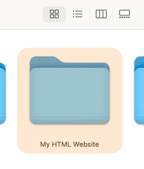
- 1) Create a folder on your computer to store the files related to your HTML and CSS website.

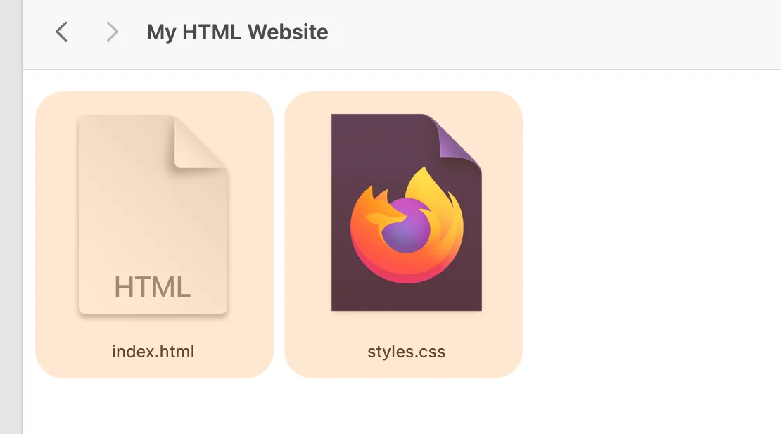
- 2) Create and insert new and empty
index.html, and styles.css files into the folder, where you will insert code related to the page structure and styling. You can do so via TextEdit (Mac) or Notepad (Windows). Alternatively, you can try everything directly online, for example, in the CodePen tool.
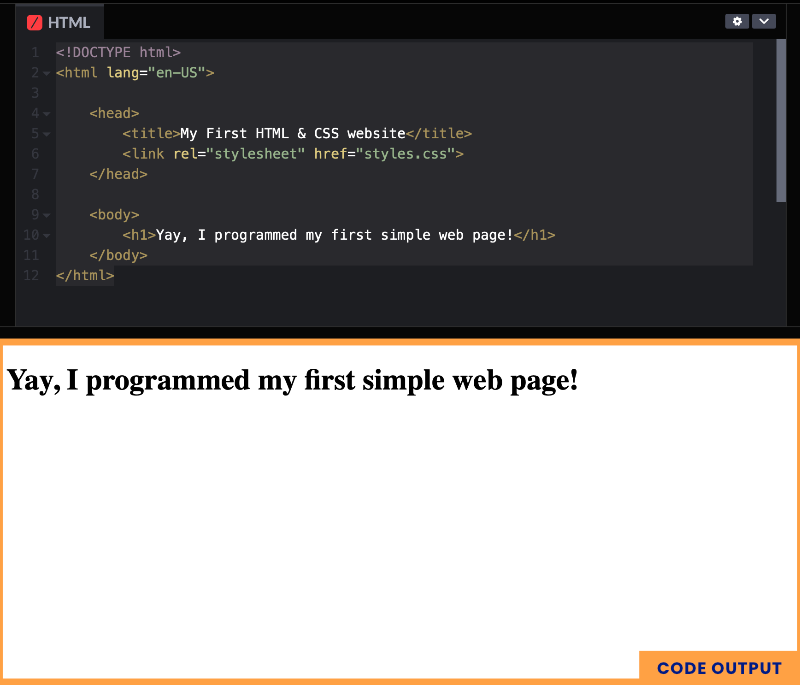
- 3) Paste the following basic code into the
index.htmlfile.
<!DOCTYPE html>
<html lang="en-US">

    <head>
        <title>My First HTML & CSS website</title>
        <link rel="stylesheet" href="styles.css">
    </head>

    <body>
        <h1>Yay, I programmed my first simple web page!</h1>
    </body>
</html>
Here is an example of output:
Creating a clear website layout
Now, we will enrich the created skeleton of the website with individual parts of the layout. We will gradually add content to them in the next step.
<!DOCTYPE html>
<html lang="en-US">

    <head>
        <title>My First HTML & CSS website</title>
        <link rel="stylesheet" href="styles.css">
    </head>

    <body>
        <header>

        </header>
        <main>
            <section id="Home">

            </section>
            <section id="About">

            </section>
            <section id="Contact">

            </section>
        </main>
        <footer>

        </footer>
    </body>
</html>
Here is an example of how it looks in an HTML editor (in my case, CodePen):
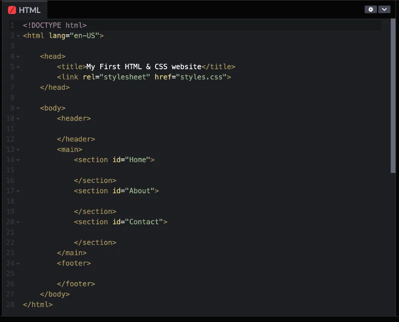
Filling the HTML layout with content
We will now add detailed content to the pre-prepared layout, which we will beautify in the next step (style it using CSS).
<!DOCTYPE html>
<html lang="en-US">

    <head>
        <title>My First HTML & CSS website</title>
        <link rel="stylesheet" href="styles.css">
    </head>

    <body>
        <header>
         <img src="https://buildwebcoach.com/wp-content/uploads/2024/02/html-web-profilepic.webp" class="photo-profile">
            <nav>
                <ul>
                    <li><a href="#home">Homepage</a></li>
                    <li><a href="#about">About me</a></li>
                    <li><a href="#contact">Contact me</a></li>
                </ul>
            </nav>
        </header>
        <main>
            <section id="home">
                <div class="section-content">
                    <img src="https://buildwebcoach.com/wp-content/uploads/2024/02/html-web-profilepic.webp" class="photo-profile">
                    <h1>Hey there! I am a Web Coach – a professional in making websites.</h1>
                </div>
            </section>
            <section id="about">
                <div class="section-content">
                    <h2>About Web Coach</h2>
                    <p>Hey, digital dreamers! Meet your Web Coach, the superhero who turns your website blunders into pixel-perfect wonders! Imagine me as your trainer in the gym of the internet, flexing your design muscles and squashing code bugs with a wink and a click. Whether you're a rookie who thinks PHP is a hip new band or a virtuoso of virtual vistas, I'll help you bench-press browsers and sprint through servers. Let's code, create, and even chuckle while crafting your masterpiece on the digital canvas!</p>
                </div>
            </section>
            <section id="contact">
                <div class="section-content">
                    <h2>Contact me</h2>
                    <p>You can find me in:</p>
                    <ul>
                        <li>My city office</li>
                        <li>My dog bed</li>
                        <li>With my lord in the park</li>
                    </ul>
                </div>
            </section>
        </main>
        <footer>
           © Copyright BuildWebCoach, 2024
        </footer>
    </body>
</html>
Here is an example of what the page will look like after implementing this step:

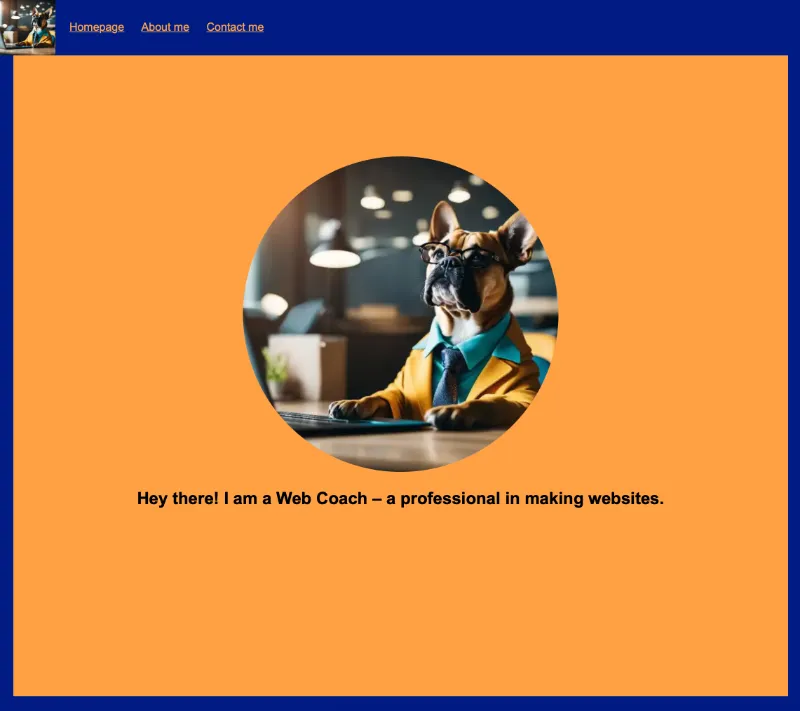
Styling the HTML layout with CSS
Now comes the time to give the page an attractive look through CSS code. Therefore, we will now save the following code into the prepared styles.css file.
h1 {
    font-family: 'Arial', sans-serif;
    font-size: 24px;
    font-weight: bold;
    text-align: center;
}

body {
    font-family: 'Arial', sans-serif;
    margin-top: 50px;
    margin-left: 0px;
    margin-right: 0px;
}

header {
    display: flex;
    position: fixed;
    top: 0;
    left: 0;
    right: 0;
    height: 80px;
    line-height: 80px;
    background-color: #001B84;
}

header * {
    display: inline;
    height: 80px;
}

header ul {
    padding: 0;
}

header li {
    margin-left: 20px;
}

header a {
  color: #ffa144;
}

section {
    height: 100vh;
    border: 20px solid #001B84;
    display: flex;
    justify-content: center;
    align-items: center;
    text-align: center;
    background-color: #ffa144;
}

#home .photo-profile {
    width: 450px;
    border-radius: 100%;
}

footer {
    text-align: center;
    padding: 50px;
    background-color: #001B84;
    color: #FFFFFF;
}
And here is the result. I hope you enjoyed this simple tutorial, and it will help you quickly create your own simple HTML and CSS-based website.